DEAS BEER
Nice by Name. Irish by Nature.
IDENTITY REBRAND + SOCIAL MEDIA
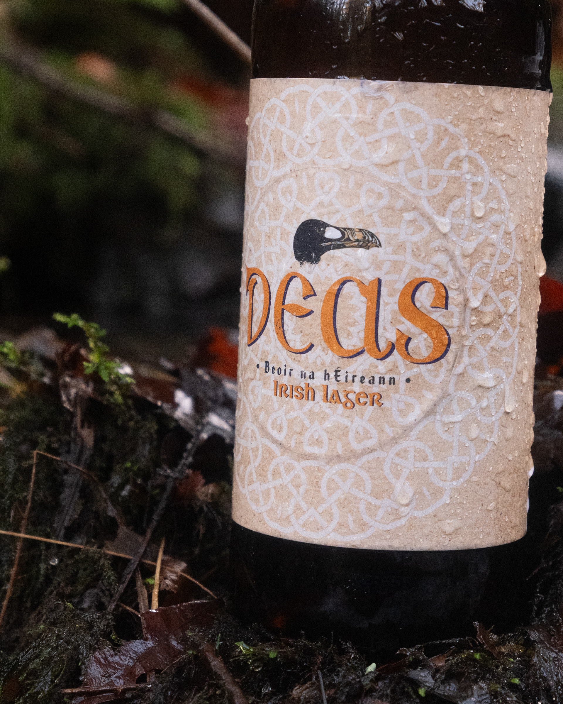
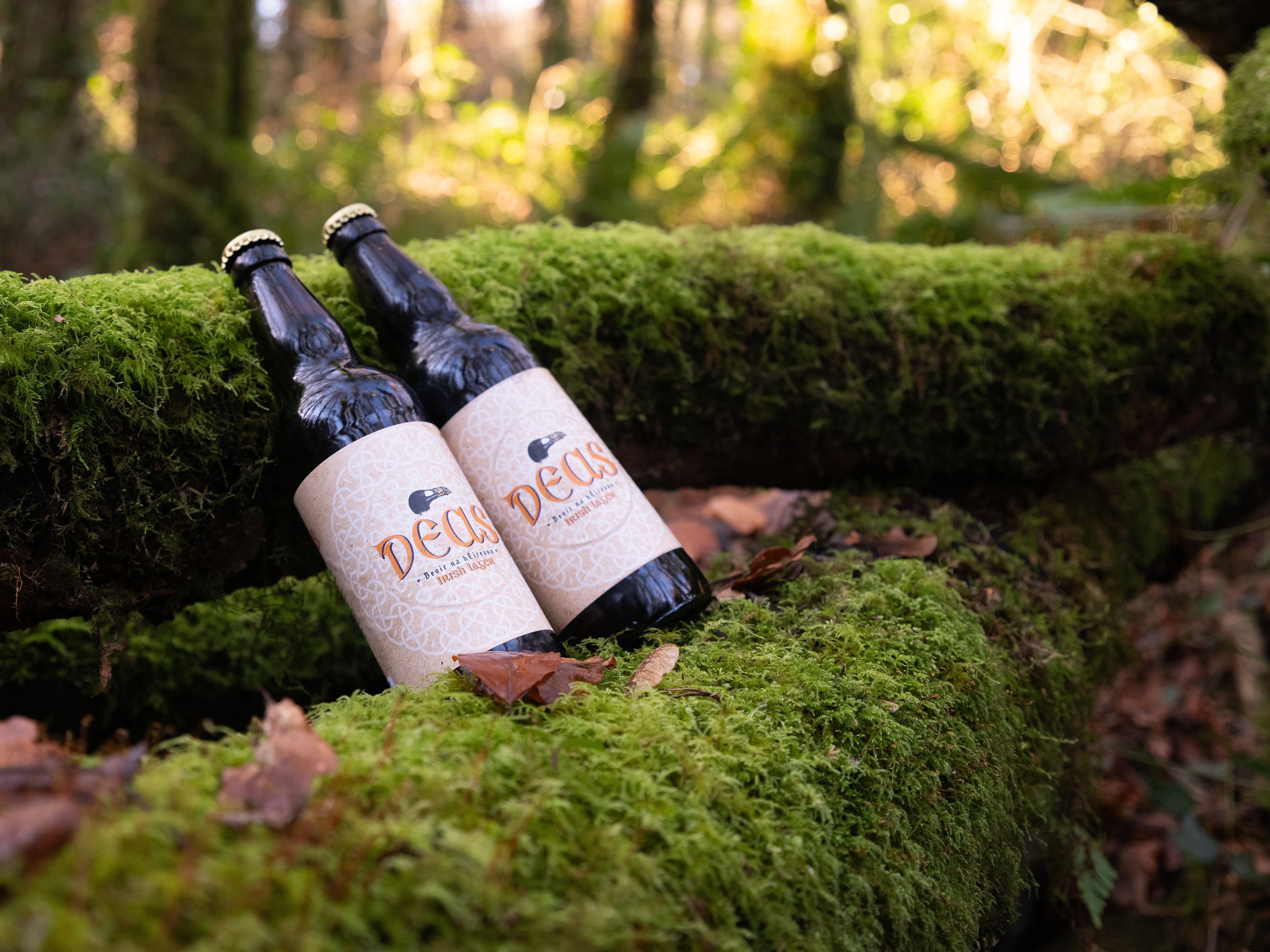

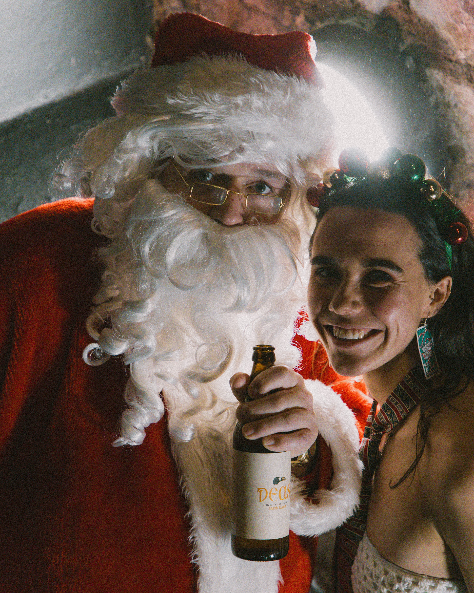
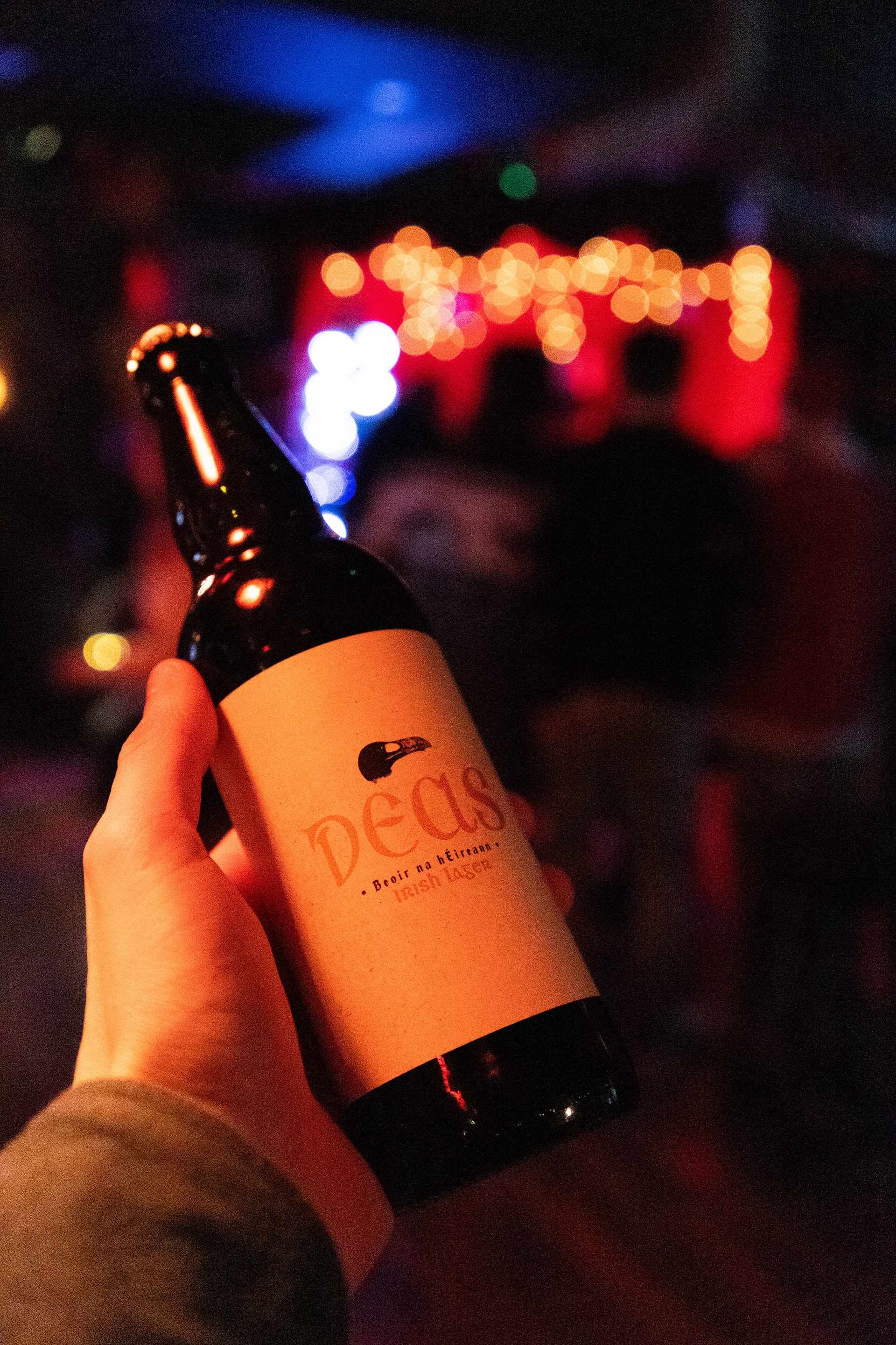
Deas is an Irish beer brand that embodies authenticity, tradition, and the resilient spirit of the Irish Auk. Rooted in grassroots values, Deas reflects the simple joys of life, with a focus on sustainability and connection. My role was to refresh the brand identity and align it with these values, creating a visual language that feels organic, modern, and true to the brand’s roots.
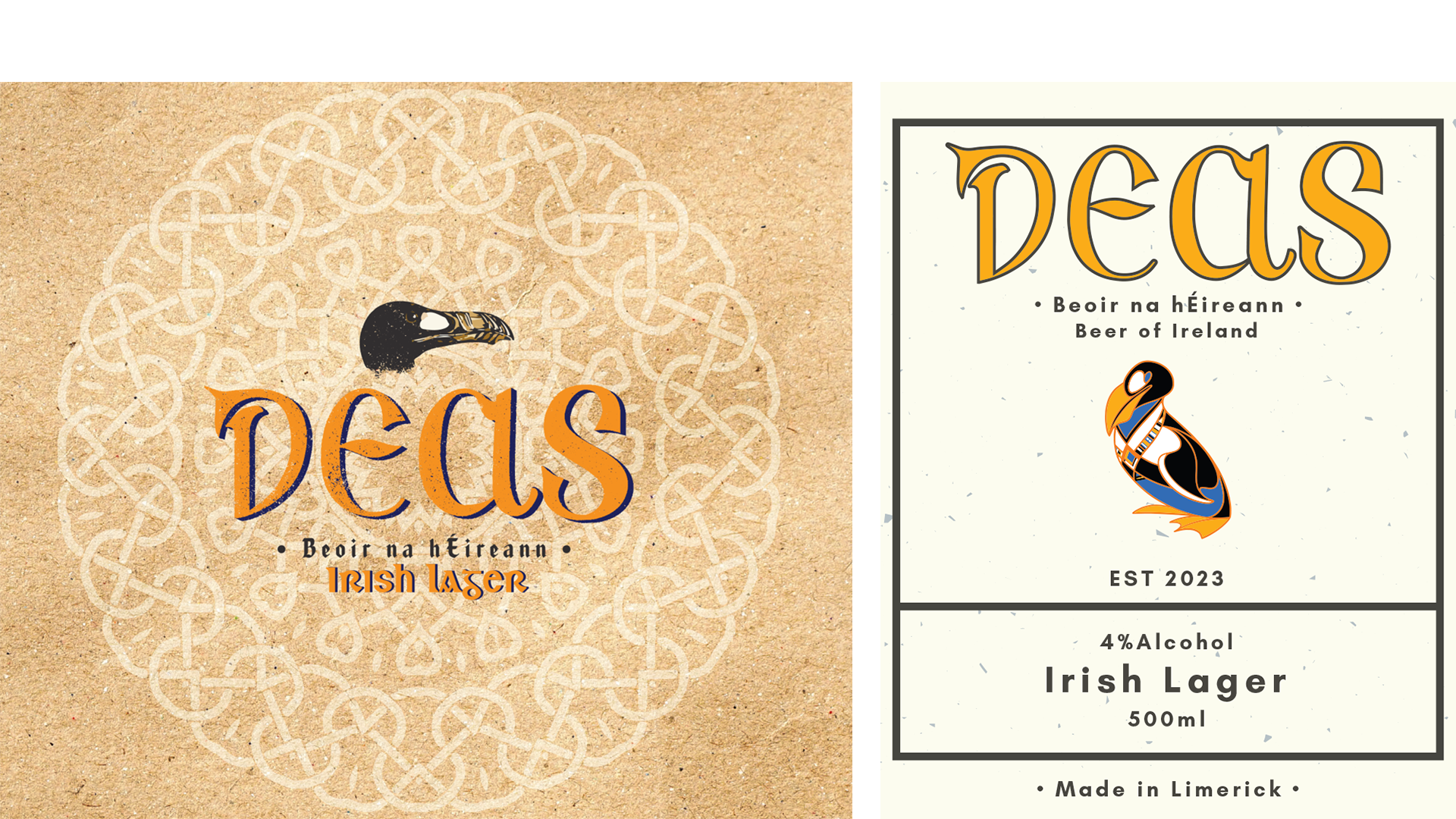
The original design felt outdated and disconnected from Deas’s grassroots nature. To address this, I introduced a recycled paper background to reflect the brand’s sustainable ethos while incorporating a grungy stamp aesthetic to give it a handcrafted, organic feel. This shift grounded the brand in its Irish heritage and emphasized its connection to nature, while still appealing to a modern audience.
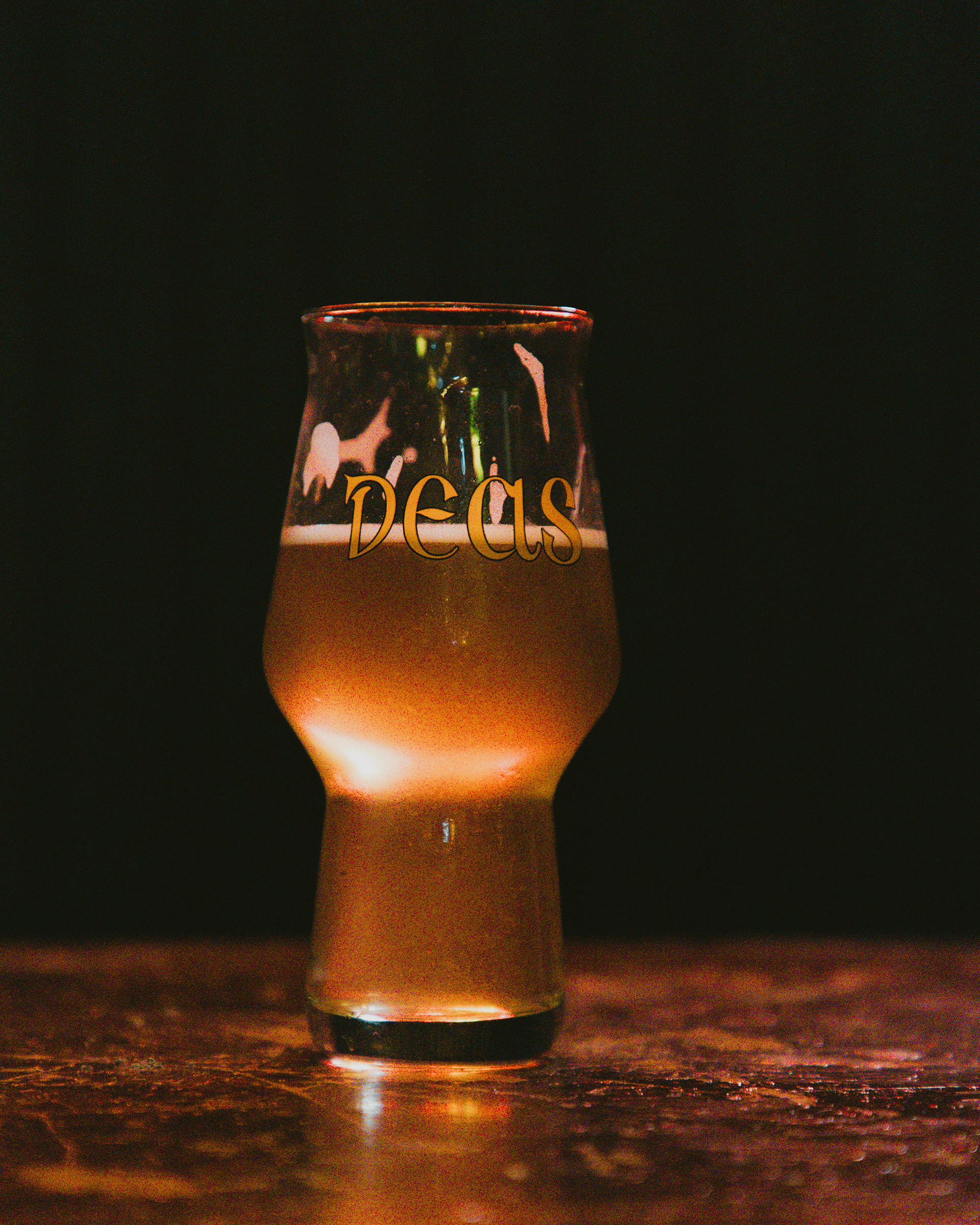
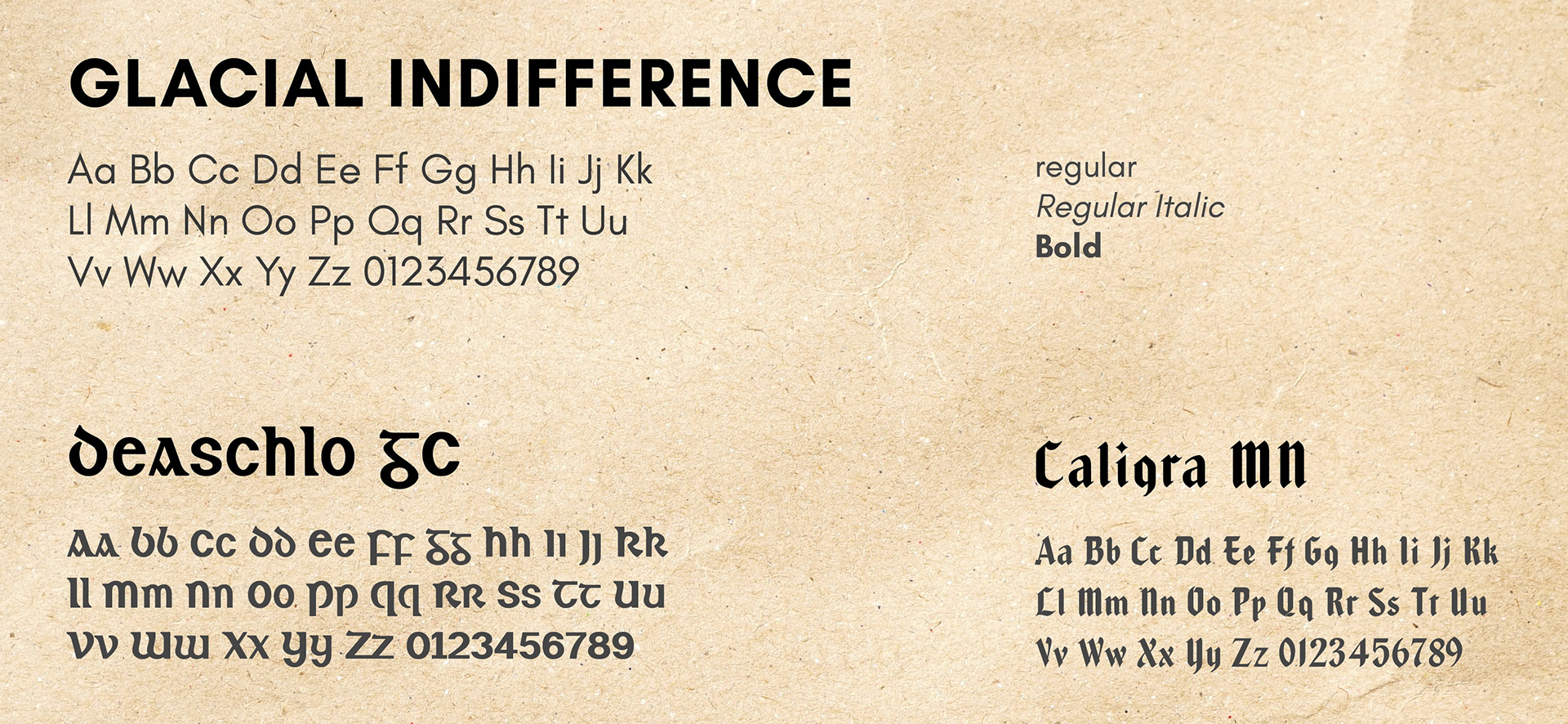
For the typography, I chose the clean sans-serif font (Glacial Indifference) for body text to ensure clarity, paired with Deaschlo GC and Caligra MN for headings. These decorative fonts add a Celtic-inspired touch that reflects the brand’s Irish heritage.
Fun fact: Deaschlo is also used for the Irish sections on street name signs in the west of Ireland, further connecting the brand to its cultural roots.
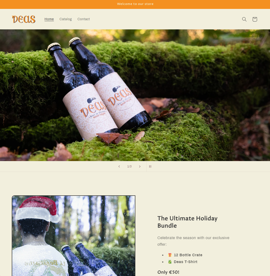
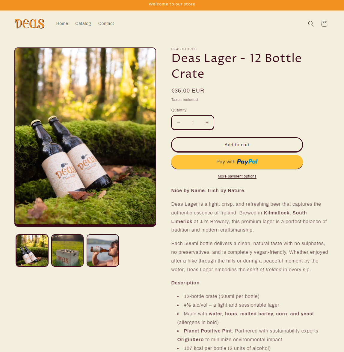
The website was designed as a streamlined sales funnel to showcase the beer and communicate the refreshed brand identity. Built using a Shopify template, the focus was on simplicity and usability, ensuring customers can easily navigate the site without distraction. Bold visuals, intuitive navigation, and cohesive branding create a user-friendly experience that stays true to Deas’s values of authenticity and simplicity.
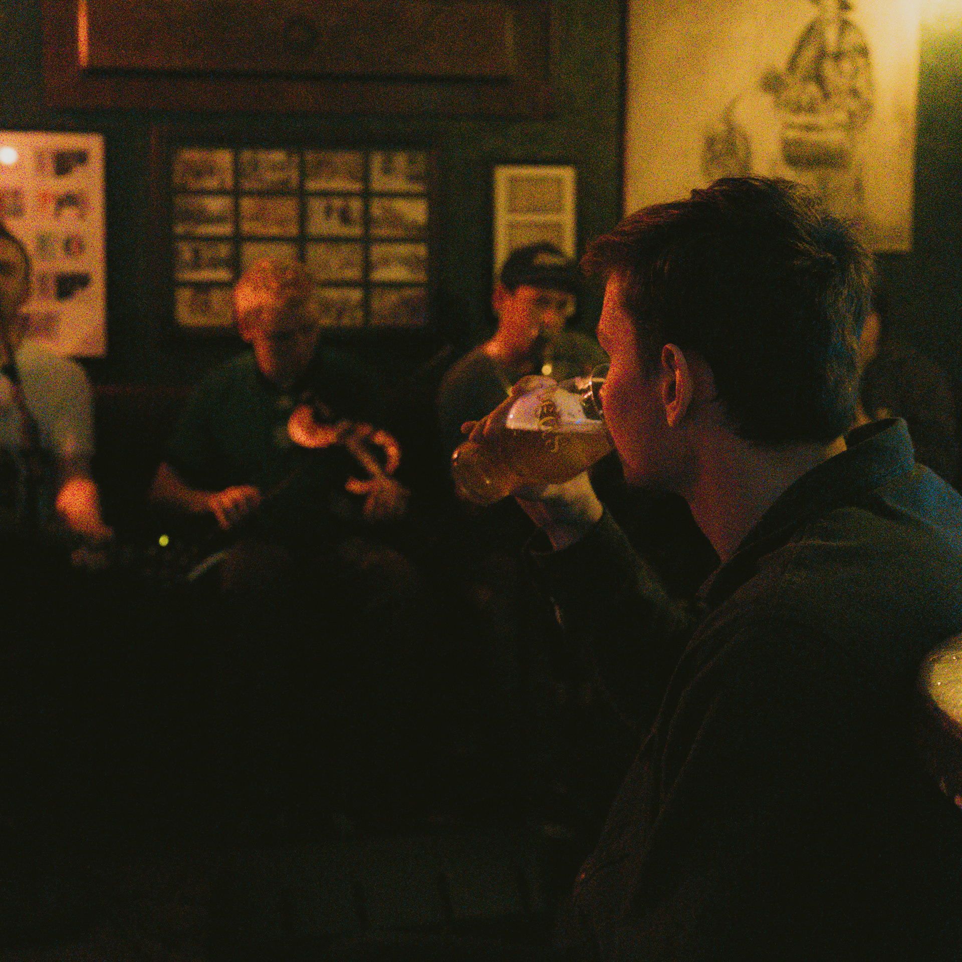
The social media videos primarily featured the older brand identity, showcasing the bottle and beer mat through Blender 3D renders, enhanced with sound design and motion graphics. The content helped the brand establish a stronger social media presence, connect with its community, and build excitement around its authentic identity.